Color Journeys Announces 2018 Colour Palette of the Year

Supported by PARA Paints with dealers across Canada

What is the Serenity Palette?

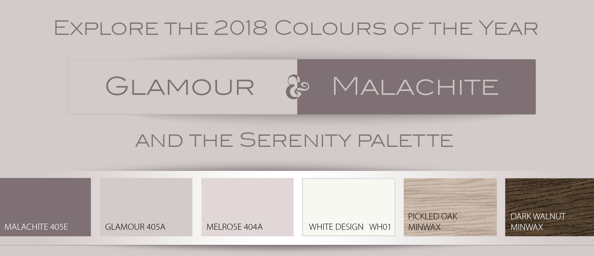
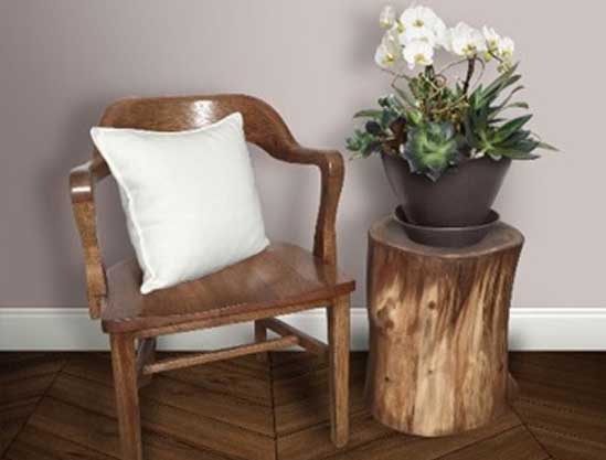
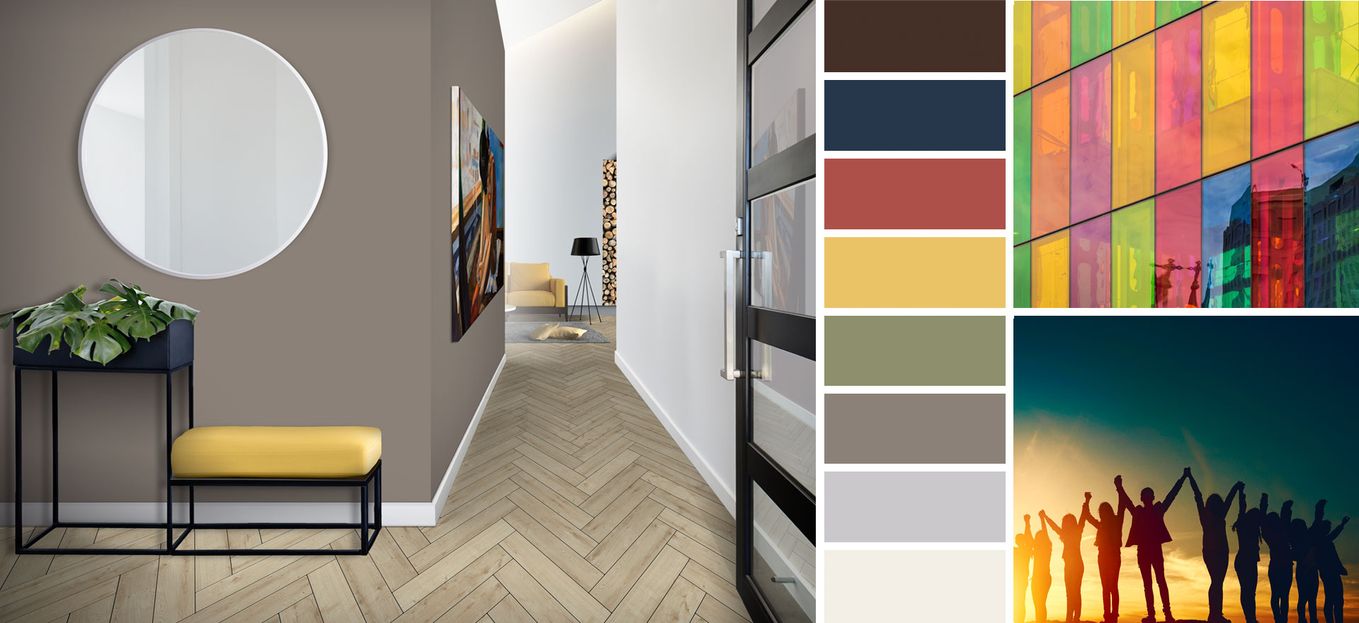
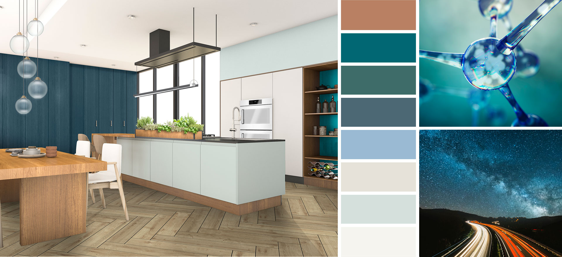
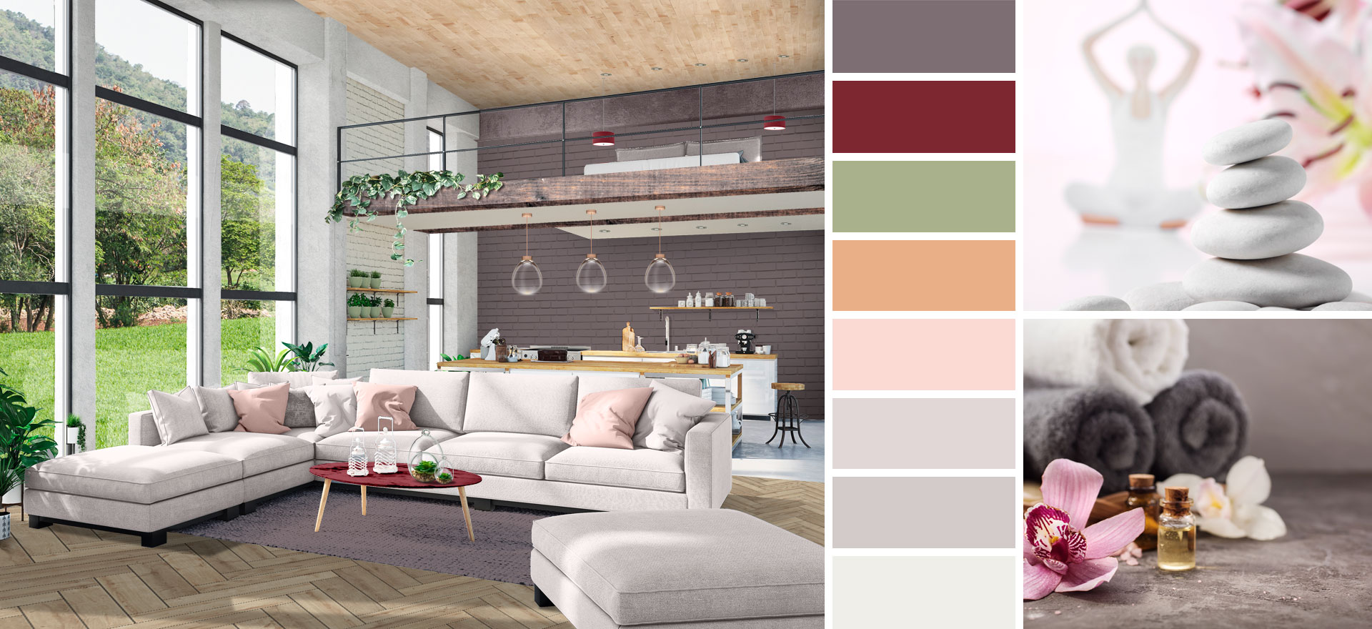
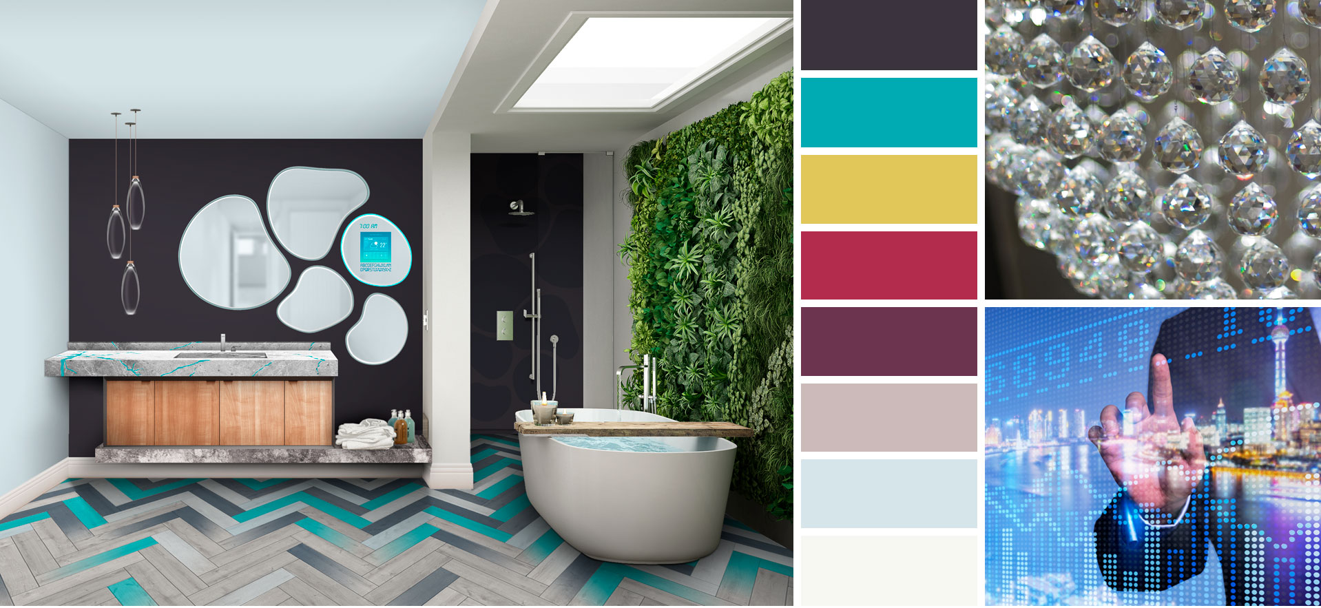
The palette was designed with Scandinavian sensibility and sustainability in mind. Our homes are our sanctuary, our place of serenity. Tap into your inner peace in your living or work space with the simplicity of colour. Glamour is a delicate, minimalistic tone with lavender notes. Malachite is a slate stone colour with nature balanced textures. White Design is a fresh white that is perfect for trim. The Color Journeys Palette also includes trending wood stains that help to create a grounding effect in your space. Pickled Oak reveals cool tones & textures and a sense of minimalism and Dark Walnut adds a sense of luxury and warmth into your home.

Explore the rejuvenating feel of Scandinavian design in your home. 2018 launches the soft, delicatetones of Glamour (405 A), balanced by the darker stone Malachite (405 E), the statement is completed with the freshness of White Design (WH 01), and embraces wood stains such as pickled oak, or dark walnut. This quiet palette of modern neutrals awakens the feeling of calm, cool, sophisticated serenity with the meditative sounds of water trickling through a stream over rocks, and the natural woods to ground our nature-based designs and colours. You may not be able to get away to the spa to recharge in luxury, but now you can create this harmonizing palette in your own space. Book your getaway with Color Journeys.

The New Colour System

Color Journeys allows you to search for unexpected colour combinations that will inspire your design palette.

We have curated an expansive colour system of the most refined hues to complete every planned project and each imaginative endeavour. We have cataloged our palettes into five collections—Color Chronicles™, Color Directions™, Color Solutions™, Contractor Solutions ™, and Six to Mix™—created to honour a different purpose, time period, or style. Color Journeys is the true north for how-to visionaries—the road map for each of your independent design expeditions. It steers you to the right colour for any project and any design endeavour.

This new colour system is the route for trend-setting explorers—the springboard for all your creative ideas. It invigorates your spirited search for the most current, finely tuned palettes. Color Journeys is the destination for further inspiration, it is a carefully selected collection of new concepts for your distinct style. For more information visit: www.colorjourneys.ca

Choosing the Right Colour

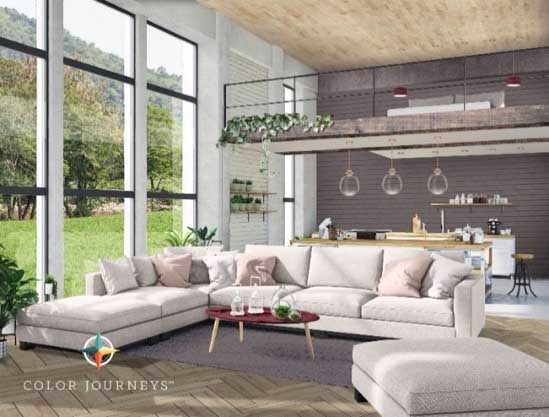
The 2018 Serenity Palette was unanimously selected by Color Journey’s designers, specializing in design and fashion. These experts study consumer insights, and global design trends to select a colour palette that is reflective of ongoing trends and consumer demands. This palette helps to create a space used to unwind – layering balanced tones of neutrals as a foundation with whites and soft pastels will help to design a meditative minimalistic room with a unique statement by adding customized wood stains and cozy deeper jewel tones which intrinsically add luxury and opulence.

“Connections with this colour palette evoke feelings of nature, they are the foundation of new neutrals that flow infinitely through designs with great rhythm and purpose,” says Garry Belfall, Brand Manager PARA Paints. “Our goal was to choose colours for our palette that are both calming and liveable to give your home a sense of inspirational design.”

See it for Yourself

Confidently enter into the new dimension of design’s new colours, finishes, textures and materials for design exploration. To explore the new Serenity Palette, or any of the 2018 Color Journeys trend colours on your walls, try the new online colour visualizer before visiting a paint store or lifting a brush. The visualizer offers advanced technology to apply any colour to an uploaded photo of your room. For more information on our brands, visit www.para.com